Insights and visions of the future

Uplifting AGL’s mobile app by adding Usage Insights and laying the foundations of a mobile Design System

Client: AGL
Primary role: Senior Product Designer
Time frame: 2022 - 2023

Summary

AGL is the largest retail energy provider in Australia. They engaged me to augment their mobile app team and provide UX and UI services to evolve and develop their mobile presence, both on Apple and Google platforms.

Both their mobile apps are developed in-house by one of their SCRUM teams. AGL underwent a significant restructuring of their design practice and engaged me to work along the mobile team to enhance the app experiences, add new features and iterate existing features.
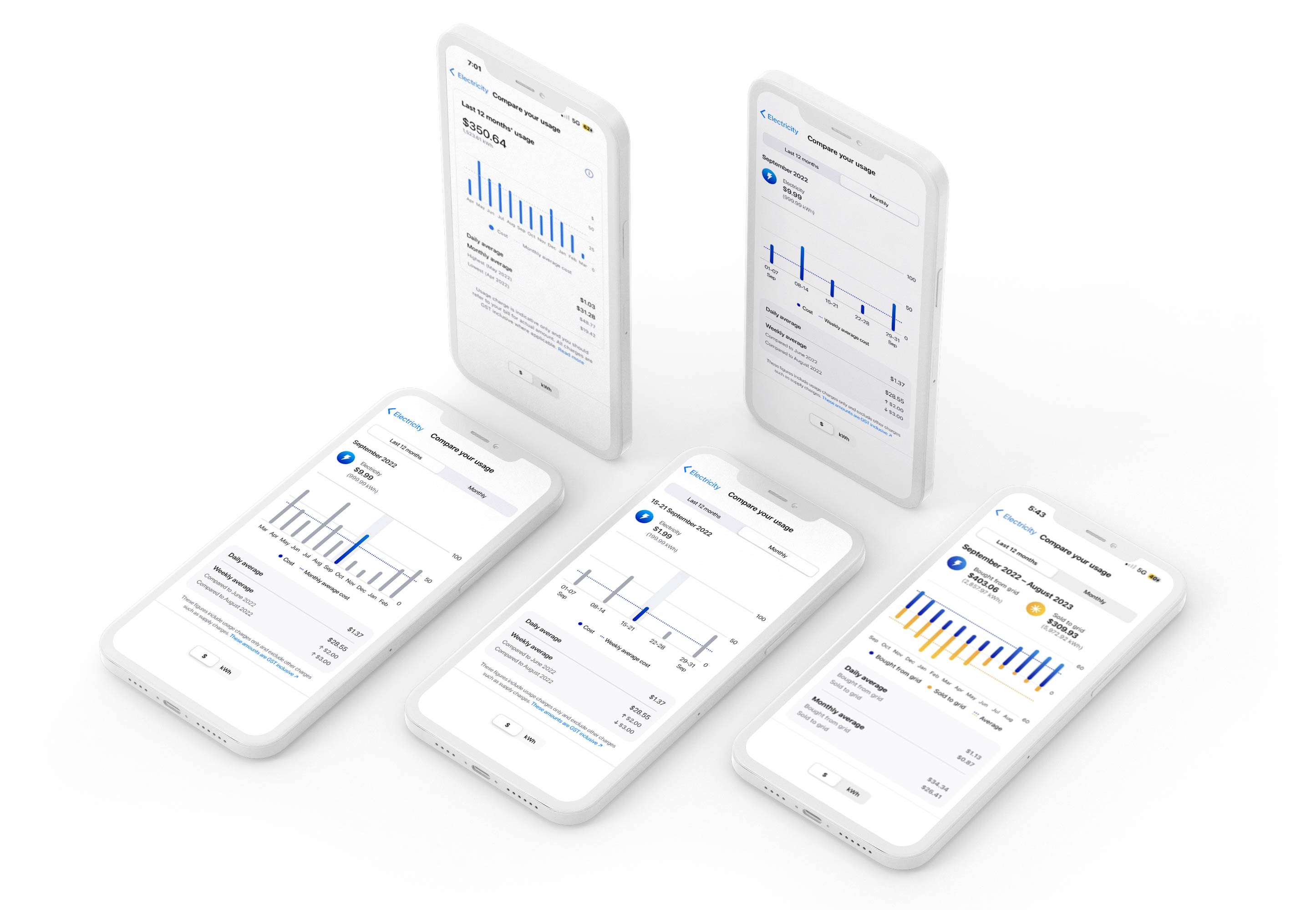
AGL Mobile app

Usage Insights in the AGL mobile app

Two weeks to get up to speed

Starting on an existing project with years of track record isn’t always easy. Imagine on top of that, having the lead designer with all the knowledge leave and you have two weeks to get up to speed as you’re taking over his role.

That was the situation I found myself in when I started on the mobile project at AGL. So I gathered whatever insights and knowledge I could and hoped that the other SCRUM team members would be able to fill any upcoming gaps.

The task was to design a new feature for the app, Usage Insights, while overseeing the development of others, such as the implementation of Dark Mode and Design Tokens. Additionally due to a lack of resources, the mobile design system was in its infancy.

Implementing dark mode and design tokens without a functioning design system made things more complicated.
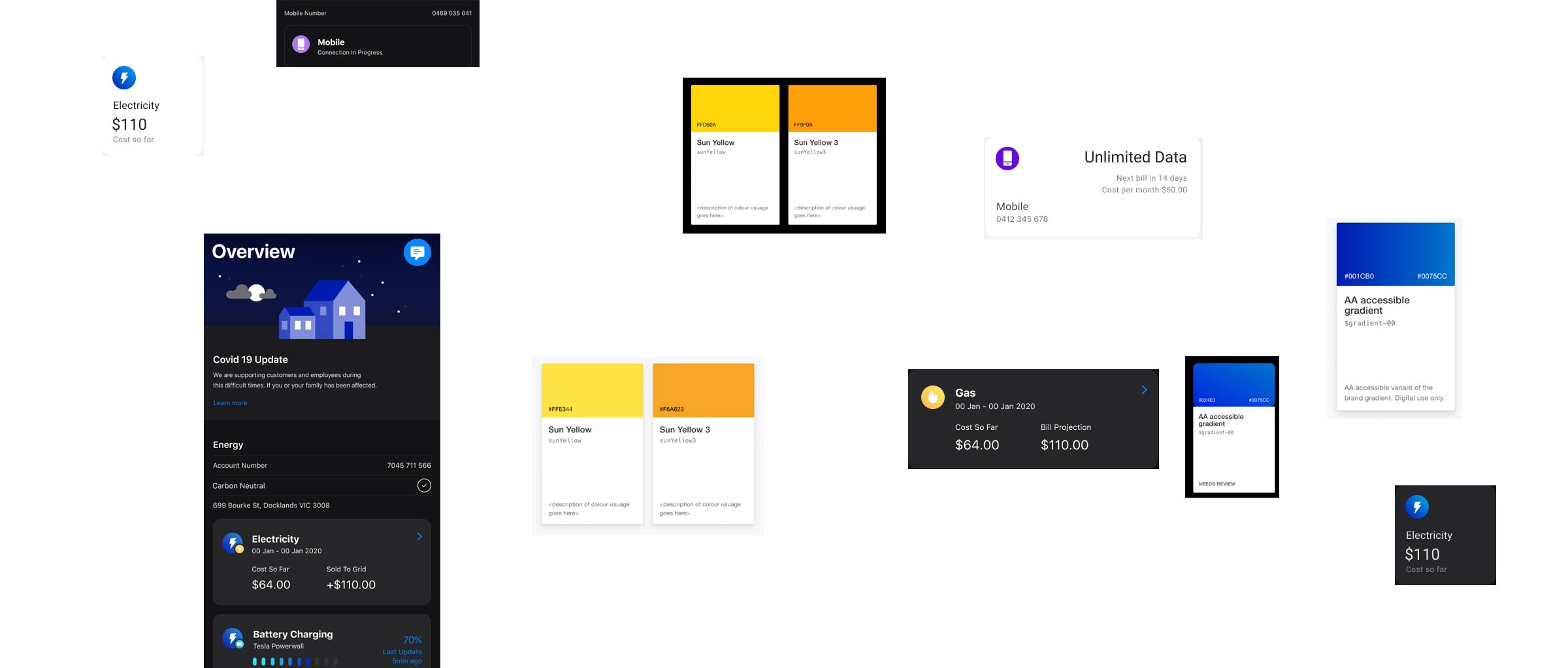
AGL Mobile app

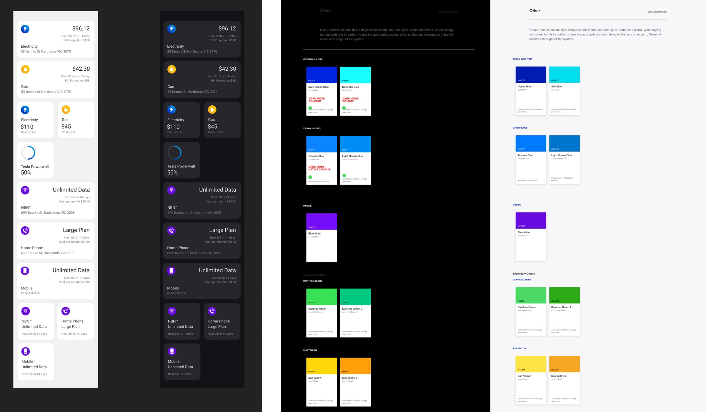
Existing components

It’s all about the right structure

I knew I had to get to a working design system, or at least, a component library, as fast as I could to avoid inconsistencies and entangled messes down the track. I started designing the new Usage Insights screens, iterating and workshopping them with other designers.

Once I got internal approval and got them ready for testing, I would add the components I used to a sandbox design system file. This should help me with upcoming designs and make sure that consistency was maintained.

Similarly I would document the design tokens we signed off on in collaboration with the developers to create an app-specific colour library as well as a system that allows for rapid switching between dark and light modes.

The creation of a component library wasn't part of the job, but it kept me sane and organised.
AGL Mobile app

Light & Dark mode components and tokens

Insights, Tokens and a Blue Sky

Over the course of twelve months I managed to create a foundational Design Library that included light and dark modes, most of the commonly used components, design tokens and variations for accessibility and sizing for both iOS and Android.

We shipped the first phase of the Usage Insights feature which was well received by the users 4.7* in the App Store, 4.5* in Google Play).

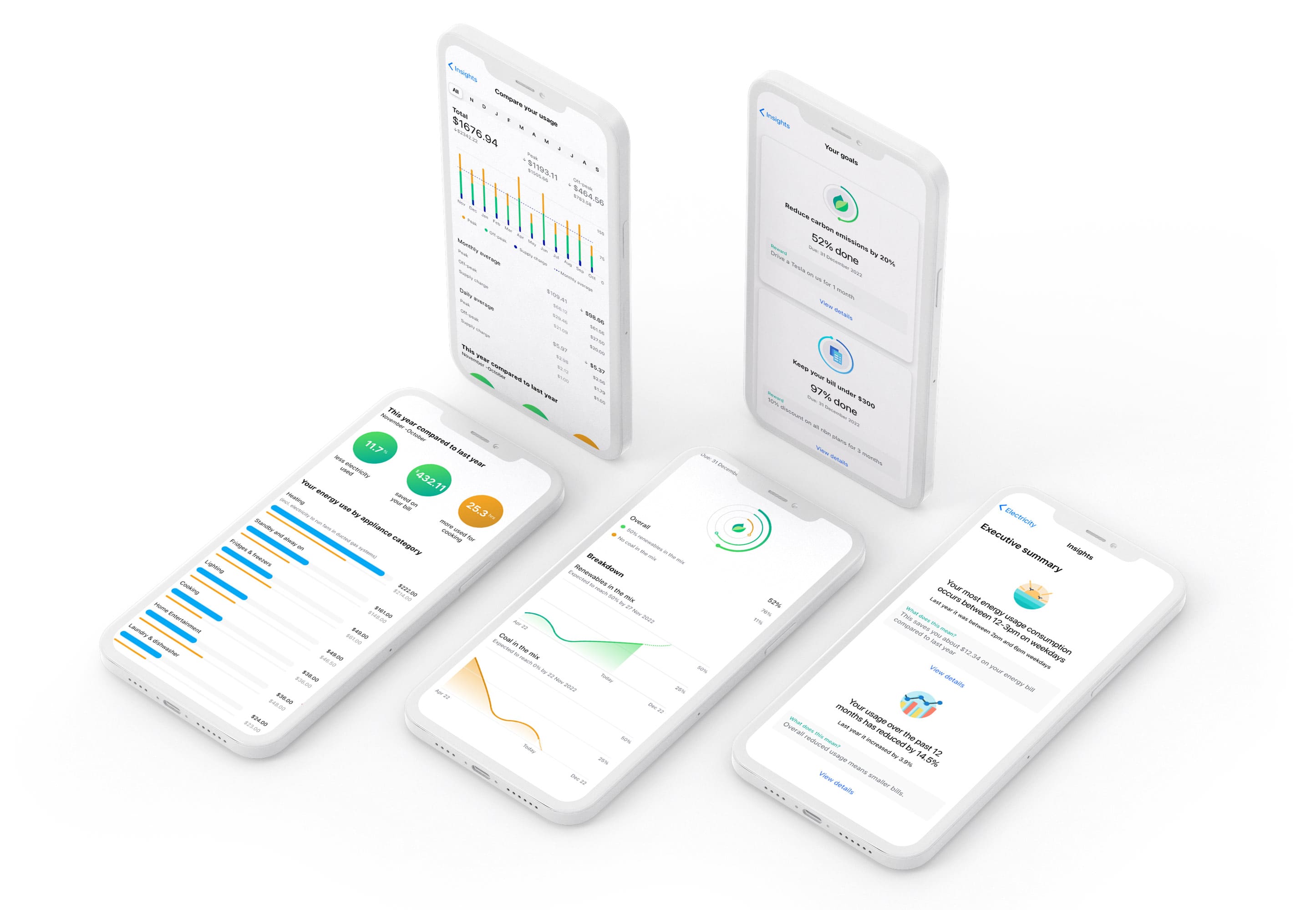
I also created a Blue Sky vision of the feature which I designed without any strings, dependencies or restrictions attached. The concept was presented to key stakeholders in the business and being incorporated in the company’s roadmap for their mobile apps.

AGL Mobile app

Blue Sky vision of the Usage Insights